THE PROBLEM
Studio 17’s website relied entirely on generic, AI generated content that failed to accurately represent the studio, its services, or its recording spaces. Visitors could not find clear information about available rooms, equipment, pricing, or what made the studio unique, making it difficult for artists to understand what they were booking.
In addition, the website did not support online scheduling. The only way to book a session was by calling a phone number, creating unnecessary friction for artists who expect fast, digital booking options. This lack of clarity and functionality limited discoverability, reduced trust, and made it harder for Studio 17 to convert interested visitors into booked sessions.
THE PROCESS
For the Studio 17 project, my role focused on research driven design and concept development to support a pitch to the studio manager. I began by reviewing the existing AI generated website and gathering customer feedback to understand user confusion, missing information, and booking pain points.
Using these insights, I defined key user needs and translated them into a proposed website experience that clearly outlines Studio 17’s services, rooms, and booking flow. I created wireframes and high fidelity designs that demonstrated how an online booking system and transparent studio information could improve usability and conversions.
The final designs were used as a strategic pitch, showing how a user centered approach could strengthen Studio 17’s digital presence and better meet customer expectations.
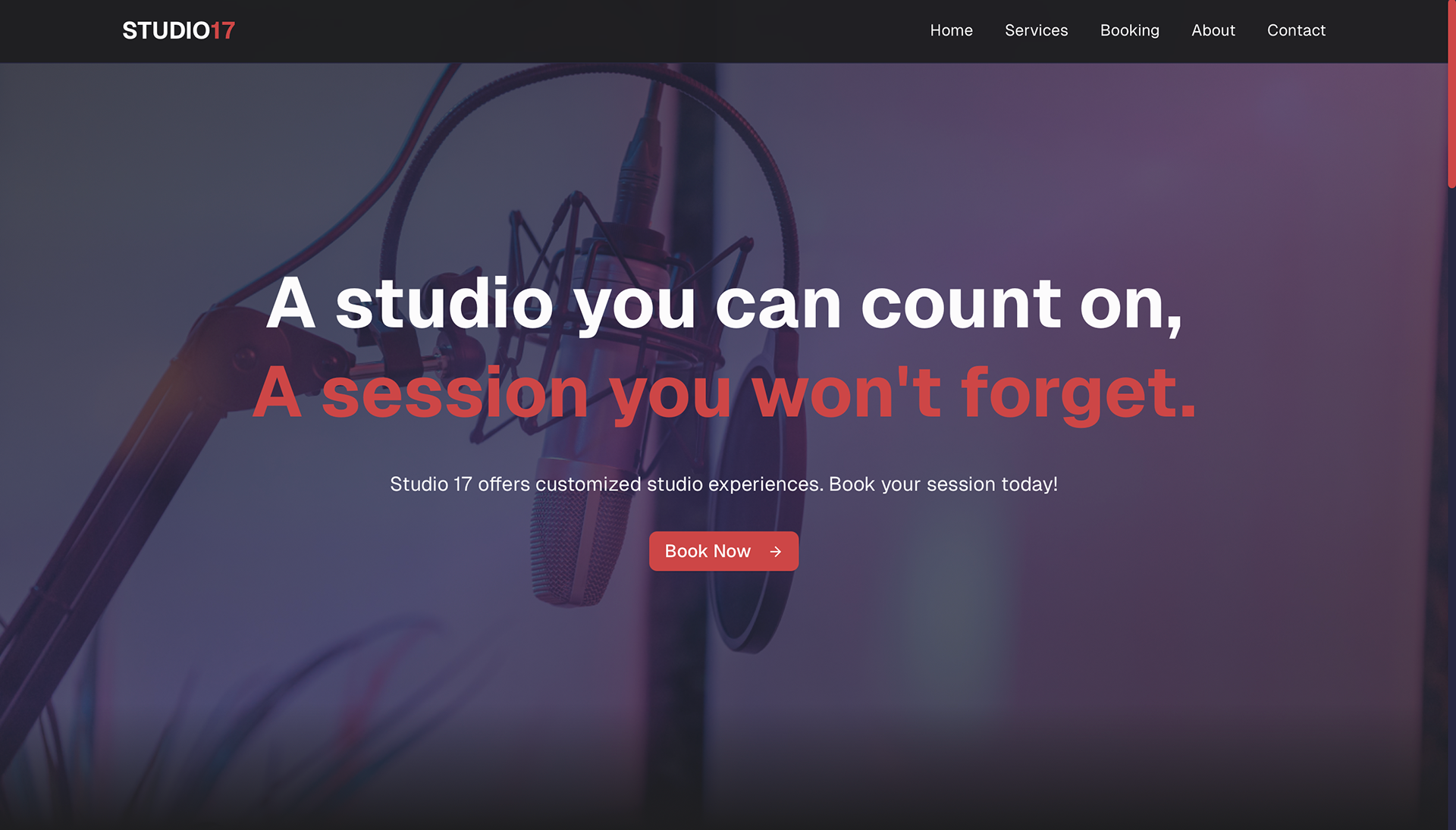
How can Studio 17’s website feel professional and trustworthy while still reflecting the gritty, trend driven energy of a Brooklyn recording studio?
RESEARCH
User Research
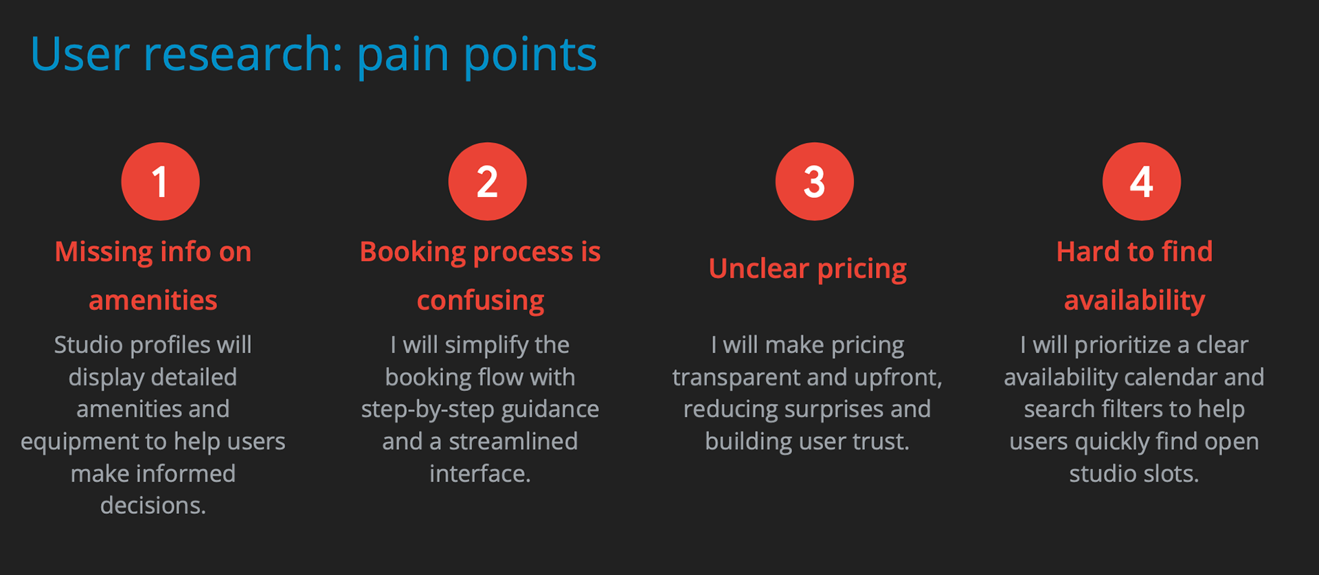
To better understand the booking experience, I spoke directly with artists before their studio sessions to learn how they discovered Studio 17 and what the booking process was like for them. These informal conversations helped surface frustrations around unclear information, reliance on phone calls, and uncertainty about services and room options.
To support these insights with structured feedback, I asked participants to complete a short survey about their booking experience. The combined qualitative and quantitative input informed the design direction and ensured the proposed website addressed real user needs and expectations.
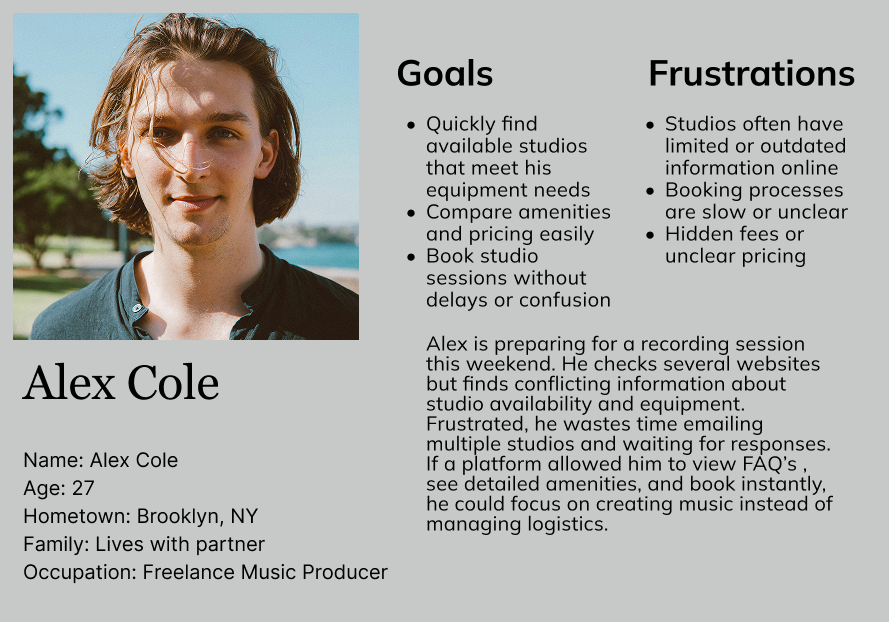
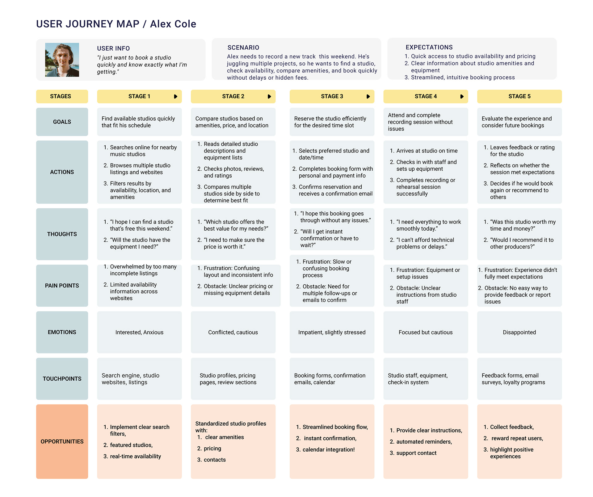
Persona
After analyzing the key findings, I created a provisional persona to help communicate information collected about users through out the design process.
IDEATION
Concept and Strategy
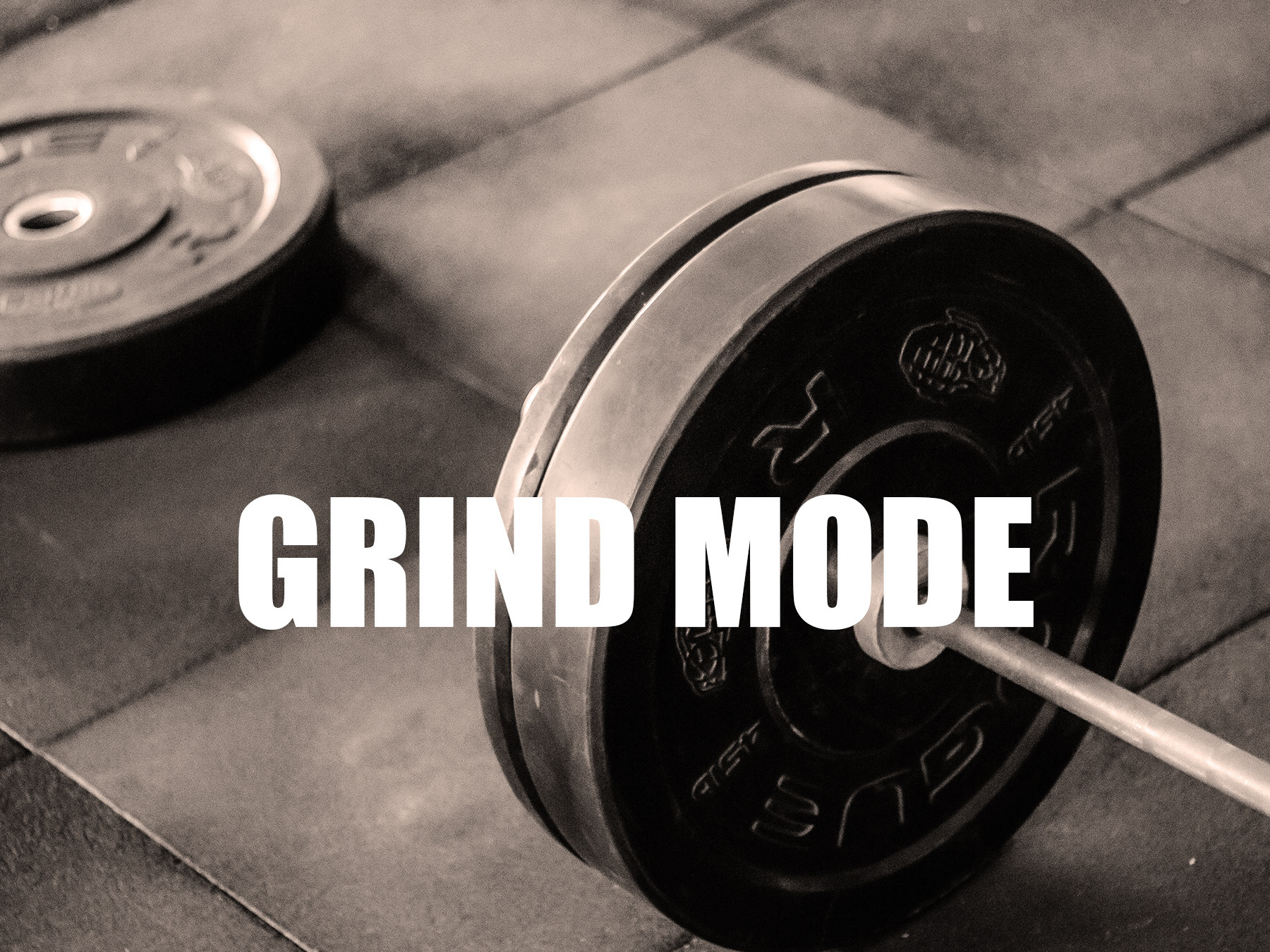
For Grind Mode, I designed a system that brings clarity, structure, and connection to the fitness experience. The concept focuses on giving users one place to plan workouts, track progress, sign in to partner gyms, reserve equipment, check renovation updates, and connect with their fitness community.
To support both users and gym staff, Grind Mode includes an admin side where gyms can update class schedules, equipment availability, and renovation changes at any time. This creates a real time, reliable experience that reduces confusion and helps users stay consistent with their goals.
Information Architecture and Navigation
To organize the wide range of features in a way that stayed simple and intuitive, I created a hierarchical navigation system. This structure allows users to move smoothly between core areas like Workouts, Gym Access, Reservations, Updates, and Community without feeling overwhelmed. It also gives space for future growth as more gym partners or fitness features are added.
SITE MAP
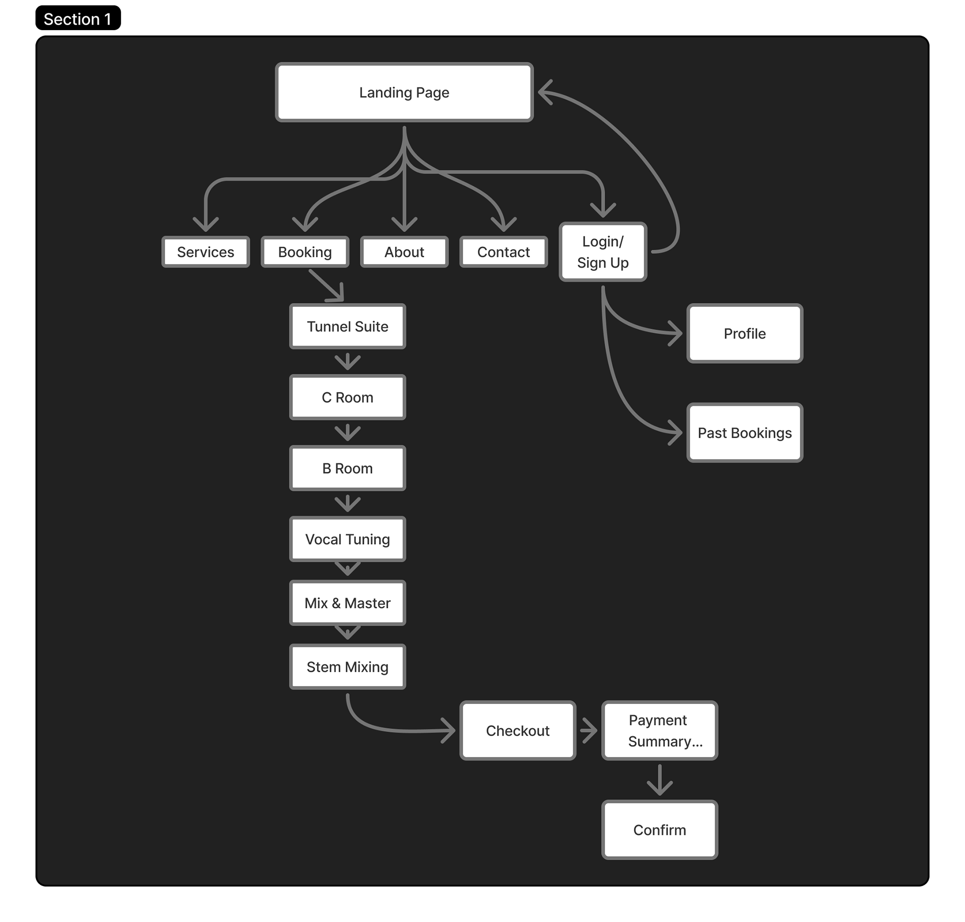
Site Map and User Flows
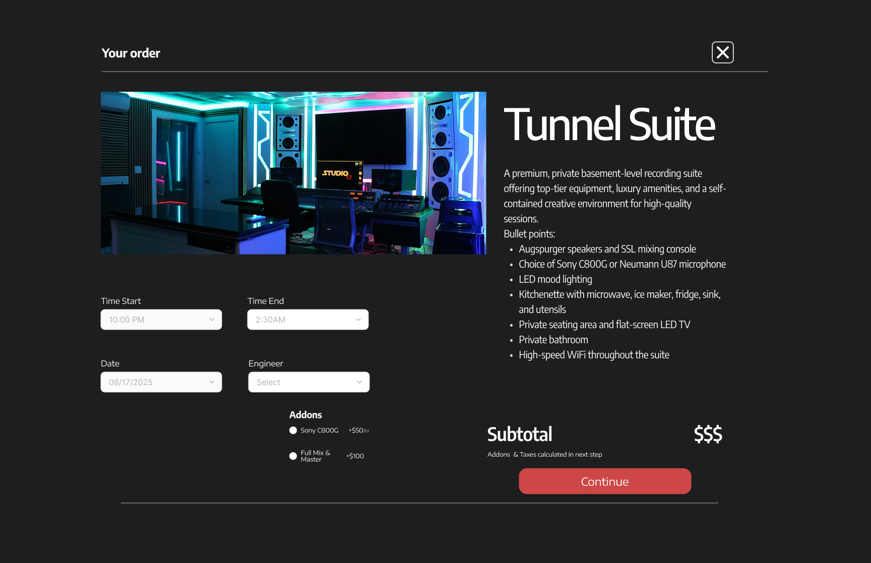
The sitemap was designed to create a clear, intuitive structure that guides users from discovery to booking with minimal friction. The landing page serves as the central entry point, directing users to core sections including Services, Booking, About, Contact, and Login or Sign Up.
The Booking flow was intentionally prioritized, allowing users to move step by step through available offerings such as studio rooms and services. From selecting a space or service, users progress through checkout, review a payment summary, and confirm their booking, creating a seamless end to end scheduling experience.
Account based features were included to support returning users, with access to profiles and past bookings after login. Overall, the sitemap balances simplicity with functionality, ensuring first time visitors can quickly understand what Studio 17 offers while enabling repeat users to book efficiently.
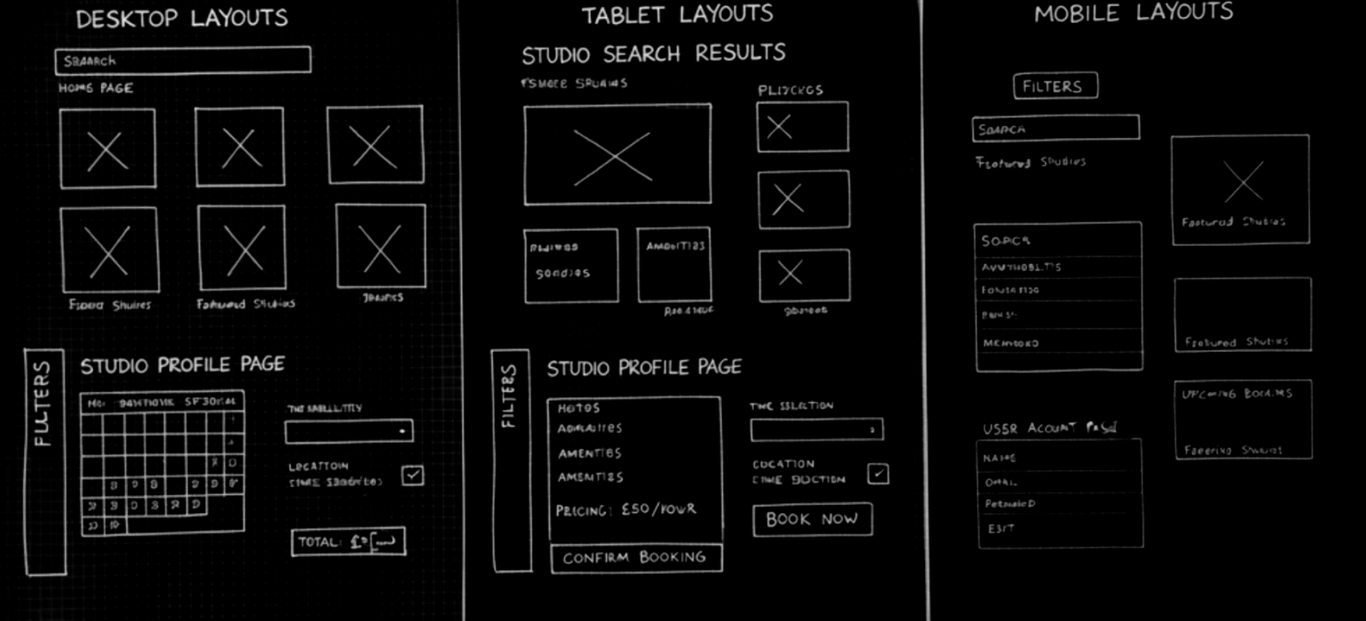
Lo-Fi Sketches
The goal of the paper wireframes was to quickly explore layout ideas and user flows for the studio booking website. The thought process focused on efficiency and clarity, ensuring that users like Alex could easily search for studios, compare amenities, check availability, and complete bookings without confusion or unnecessary steps.

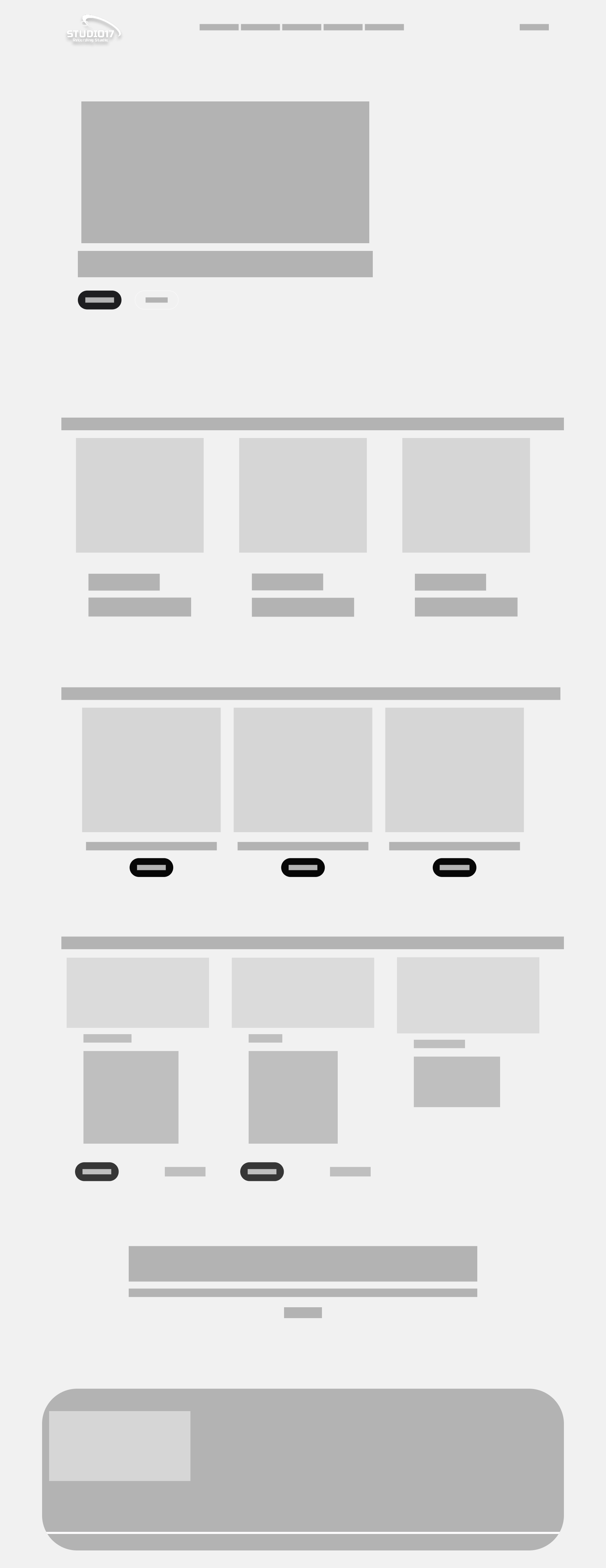
Digital Wireframes

Based on my research findings, I prioritized three key UX objectives for Studio 17:
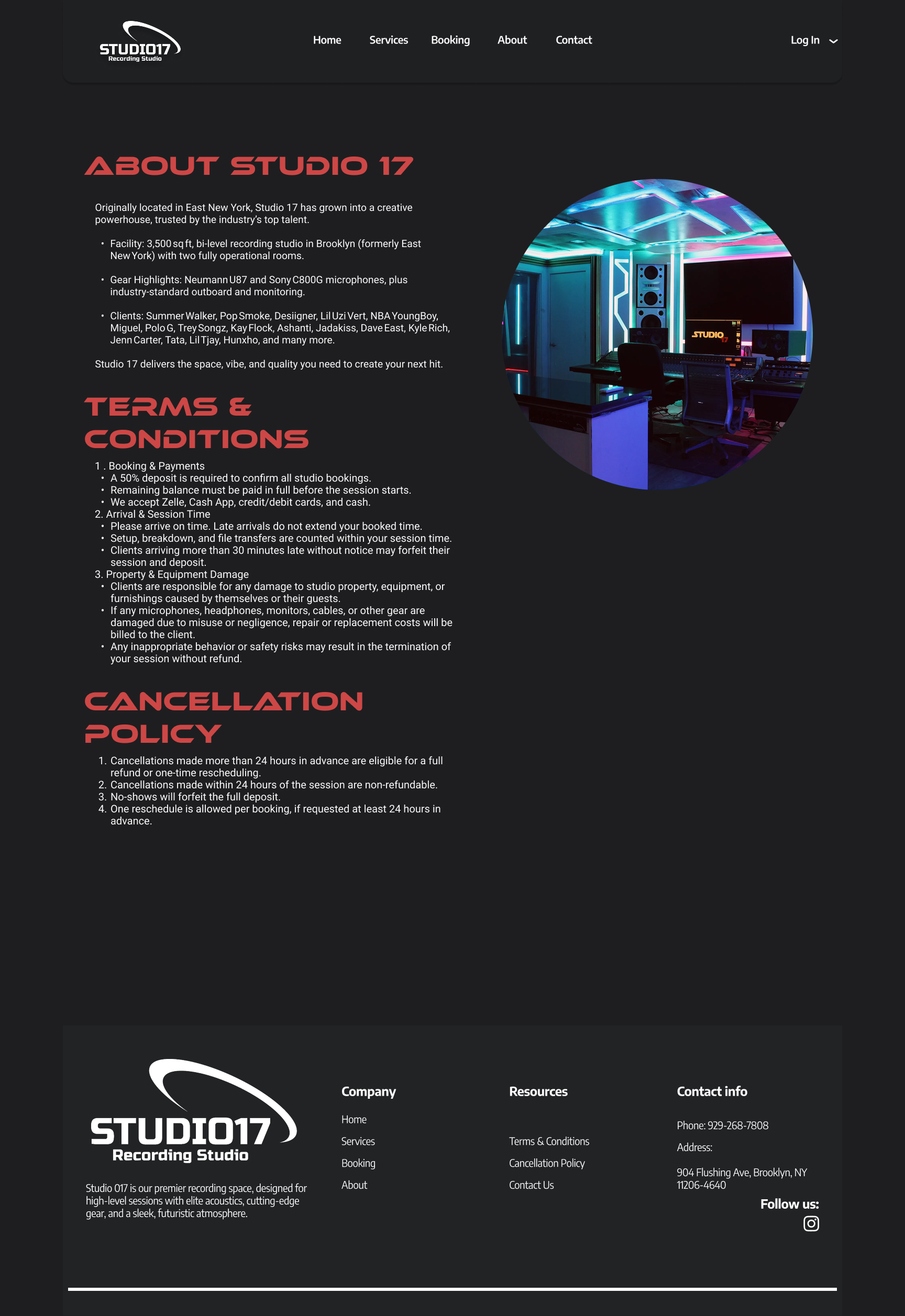
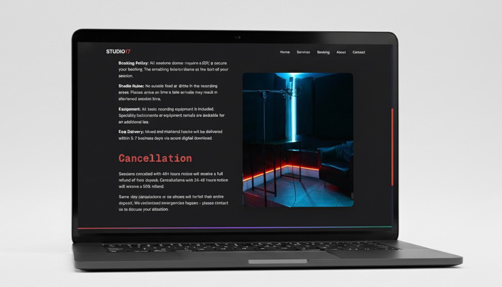
Establish clarity and transparency by designing a platform where artists can easily understand available rooms, services, equipment, and pricing without relying on phone calls or guesswork.
Streamline the booking experience by enabling users to schedule studio sessions directly through the website with a clear, step by step flow from selection to confirmation.
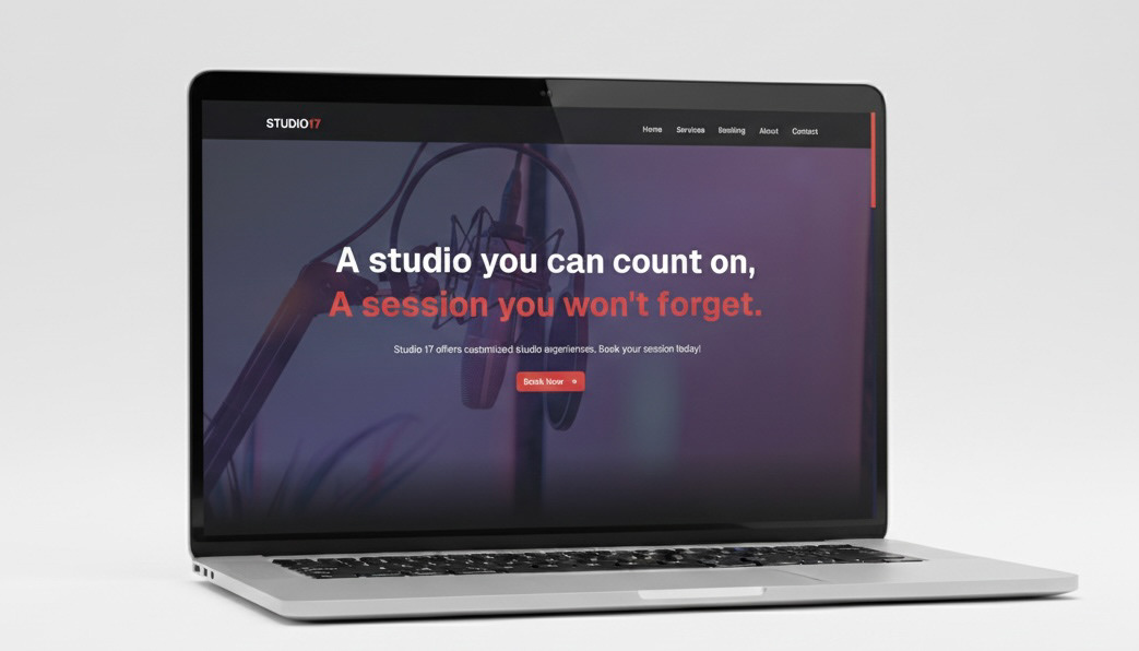
Build trust and credibility by presenting Studio 17 as a professional yet authentic recording space through clear information architecture, consistent visuals, and an experience that reflects the studio’s creative identity.
PROTOTYPE
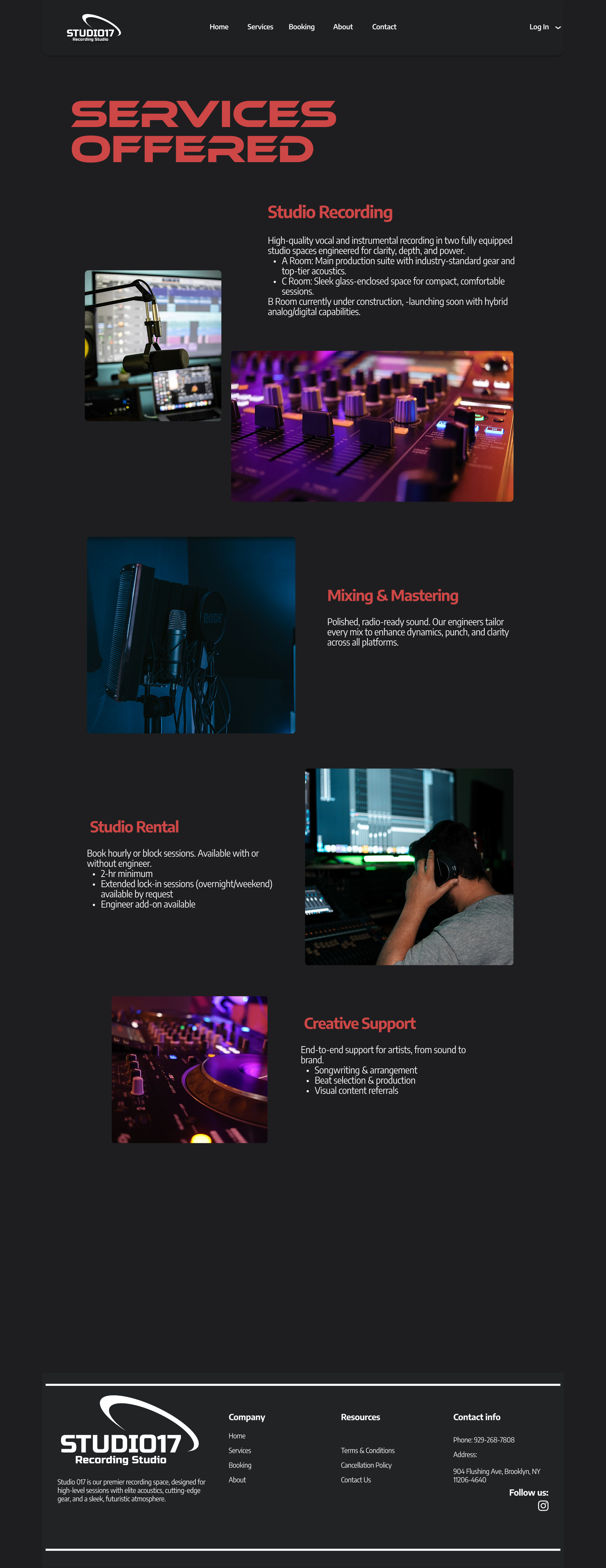
Hi Fi Prototype
I used the wireframes as a structural blueprint to build the design prototype in Figma. Once the core layouts and user flow were validated, I translated each wireframe into a high fidelity screen by applying visual hierarchy, typography, and brand elements while maintaining the original structure.
Working in Figma allowed me to connect screens into a clickable prototype that mirrored the intended booking flow. This made it possible to test interactions, evaluate usability, and ensure the final design remained aligned with both user needs and the original wireframe logic.
VERCEL WORKFLOW
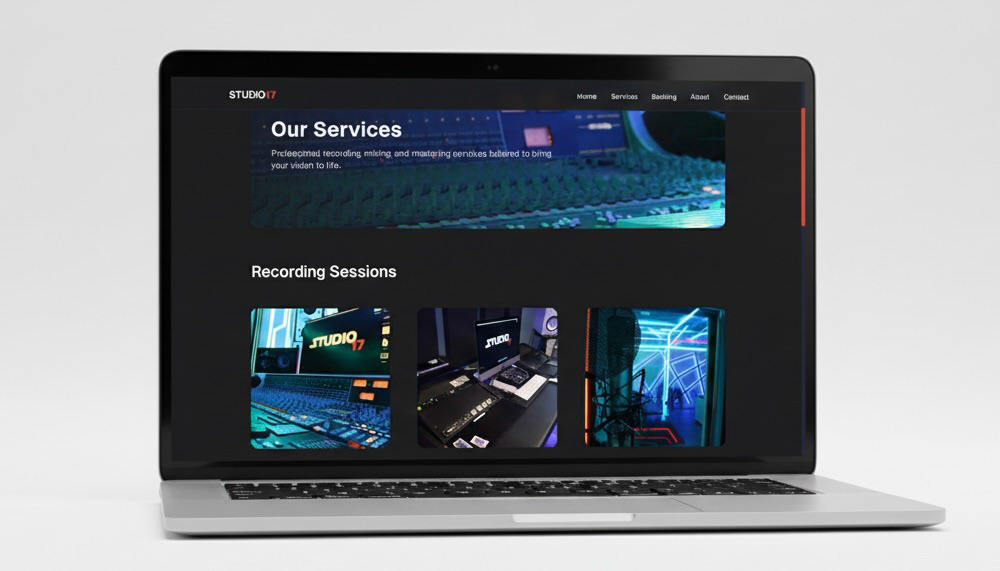
After finalizing the designs in Figma, I uploaded the screens into Vercel v0 to generate a clickable prototype that closely mirrored a real booking experience. Using v0 allowed me to rapidly translate design intent into functional UI components, making the prototype feel more realistic than a traditional static mockup.
I integrated an AI assisted workflow throughout this phase to accelerate iteration and refinement. By using AI to help generate components, adjust layouts, and quickly test variations, I was able to move faster while keeping the experience aligned with user needs. This workflow enabled more effective usability testing by allowing participants to interact with a live, responsive prototype that closely reflected the intended product.
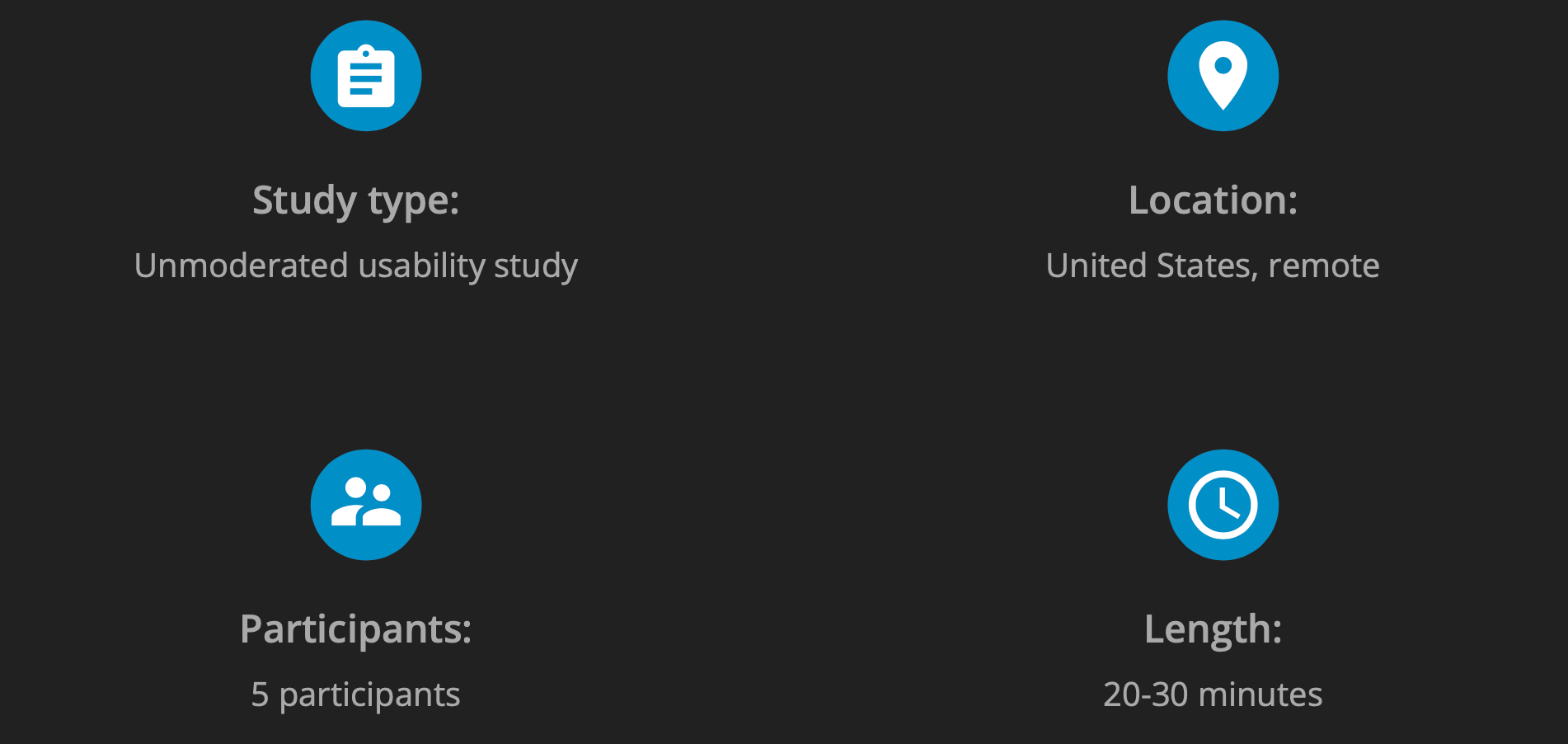
USABILITY STUDY: Parameters
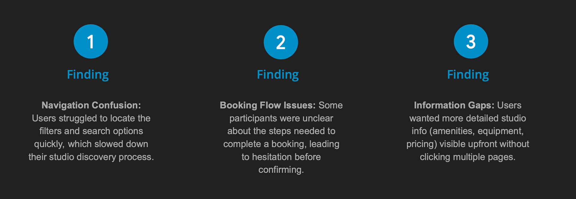
USABILITY STUDY: Findings
I conducted a 20–30 minute unmoderated usability study with musicians, producers, and audio engineers to evaluate the Studio Booking website. The study revealed key areas where users experienced challenges, which helped guide improvements to the platform’s design and functionality.
Peer Feedback Implementation
During usability testing and peer review, feedback revealed that some buttons and filters were not immediately noticeable and that certain screens felt visually cluttered. I addressed this by improving button placement for better visibility, simplifying layouts, and emphasizing key actions such as booking and filtering. Implementing these changes through Cursor improved overall usability and resulted in a clearer, more intuitive interface that better supports user goals.
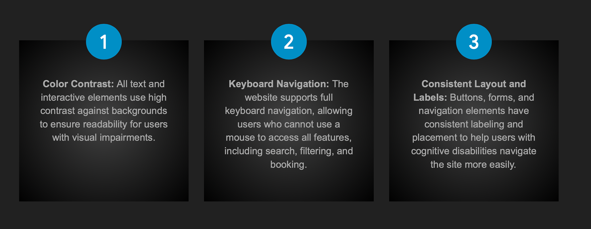
Accessibility Considerations
PRESENTATION
To prepare for presenting the project to the studio manager and owners, I created mockups and used the clickable prototype to demonstrate the proposed experience. This allowed them to see how the design would function in a real world context rather than as static screens.
As I walked them through the prototype, I explained my research findings, design decisions, and user flow logic step by step. Allowing them to interact with the prototype helped clearly communicate the value of the redesign and how it would improve clarity, usability, and booking efficiency for Studio 17.
Link to Clickable Prototype: https://nycstudio17.vercel.app
TAKEAWAYS
Impact:
The redesigned Studio Booking website improved clarity and usability, making it easier for users to find and book studios efficiently. One participant noted, “I love how quickly I can see available studios and complete my booking without any confusion.”
What I learned:
Throughout this project, I learned the importance of user-centered design, from conducting research to creating wireframes and high-fidelity mockups. I gained experience in translating user pain points into actionable design solutions and saw how peer feedback can significantly improve usability. Additionally, I developed a stronger understanding of designing for accessibility and responsive layouts across multiple devices.