OVERVIEW
Grey Cafe targets a young audience of college students and early career individuals who are drawn to creative drinks and visually clean brands. The goal was to design a website that feels modern and relevant while remaining calm and minimal.
This project focused on creating a minimalist digital experience that is visually strong and social media ready without feeling overwhelming. The design balances simplicity with trend awareness, allowing the drinks and brand personality to stand out naturally.
Through restrained layouts, intentional typography, and a focus on visual clarity, the website supports discovery and shareability. The result is a refined, minimalist presence that resonates with a younger audience and translates seamlessly across web and social platforms.
TOOLS UTILIZED
• Figma to design the interface, explore layouts, and prototype a clean, minimalist user experience
• GitHub for version control and managing development iterations
• ChatGPT to support ideation, UX copy refinement, and content structure
• Pexels and VercelV0 to translate designs into a responsive, functional website
• Cursor ensure smooth testing, iteration, and delivery
THE PROBLEM
Grey Cafe’s primary audience consists of college students and early career individuals who discover cafes through visually driven, social media forward platforms. However, the cafe’s website did not reflect its minimalist brand, creative drink offerings, or modern atmosphere, making it difficult for users to connect with the experience online. As digital presence plays a key role in discovery and engagement, this gap limited Grey Cafe’s ability to attract, inspire, and retain a younger audience seeking trendy yet clean digital experiences.
PERSONAS
JOURNEY MAP
INSIGHTS
User Expectations
Users expect the Grey Cafe ordering experience to match the ease and familiarity of apps like Starbucks. Fast navigation, clear customization options, and frictionless checkout are essential for encouraging online orders.
Visual Simplicity
A minimalist interface supports quick decision making for a young, digitally fluent audience. Clean layouts, restrained color use, and clear hierarchy help users focus on the drinks without feeling overwhelmed.
Consistency Across Touchpoints
Users build trust when the website, social media, and in store experience feel aligned. Familiar language, visual consistency, and predictable ordering steps make the transition from online ordering to in store pickup seamless.
Efficiency Drives Adoption
While creative drinks attract users, efficiency keeps them coming back. Reducing steps, limiting unnecessary choices, and clearly communicating order status and pickup timing are key to repeat usage.
Why I chose to redesign the site
I chose this design prompt because it allowed me to work closely with a real, familiar user group. As someone who frequently visits cafes and observes how people order drinks on the go, I had direct access to user behaviors and pain points. Designing an online ordering experience for Grey Cafe aligned with my empathy driven approach, allowing me to ground design decisions in real world habits and expectations.
Framing the design problem
After selecting the prompt, I framed the design problem by focusing on the core user needs and context surrounding online cafe ordering. To do this, I established the following:
1.Who is the target user?
College students and early career individuals who value speed, aesthetics, and convenience when ordering drinks online.
College students and early career individuals who value speed, aesthetics, and convenience when ordering drinks online.
2. What are the key user goals?
To quickly browse the menu, customize drinks, place an order ahead, and pick up without waiting in line.
To quickly browse the menu, customize drinks, place an order ahead, and pick up without waiting in line.
3. What is the context of use?
Users are often ordering on their phones while commuting, studying, or between classes or meetings.
Users are often ordering on their phones while commuting, studying, or between classes or meetings.
4. What constraints did I need to consider?
Limited attention spans, mobile first interactions, and the need to keep customization simple without overwhelming users.
Limited attention spans, mobile first interactions, and the need to keep customization simple without overwhelming users.
5. What is the ultimate impact?
A streamlined, minimal online ordering experience that encourages repeat use and strengthens Grey Cafe’s connection with a young, digitally native audience.
A streamlined, minimal online ordering experience that encourages repeat use and strengthens Grey Cafe’s connection with a young, digitally native audience.
IDEATE
Wireframe
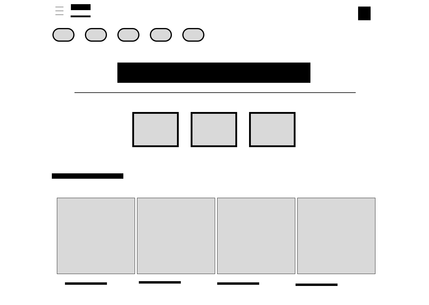
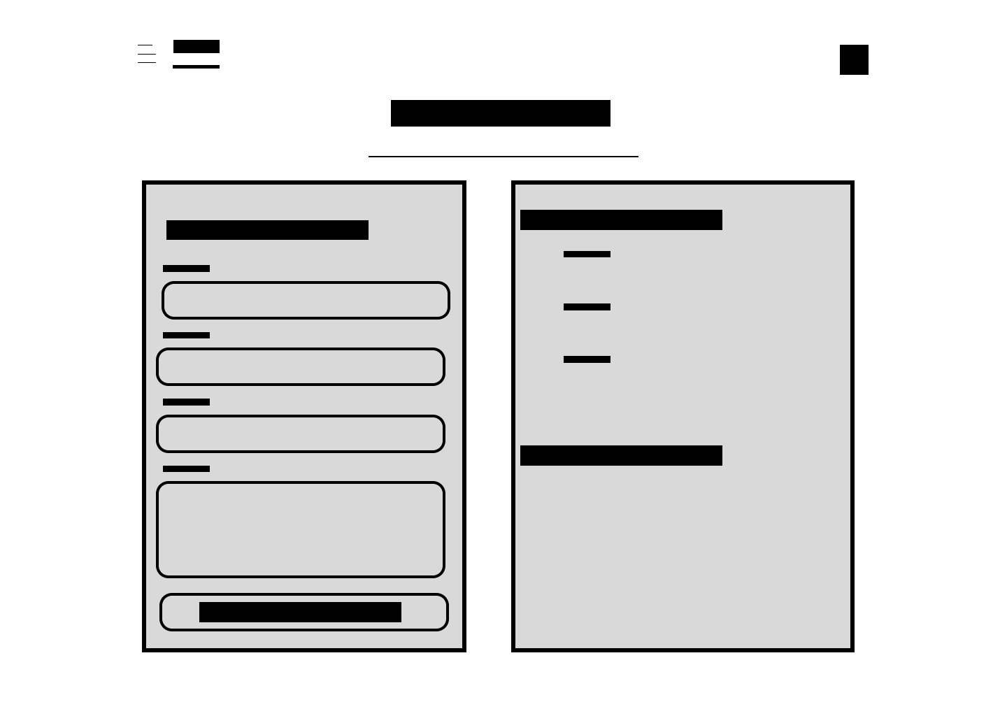
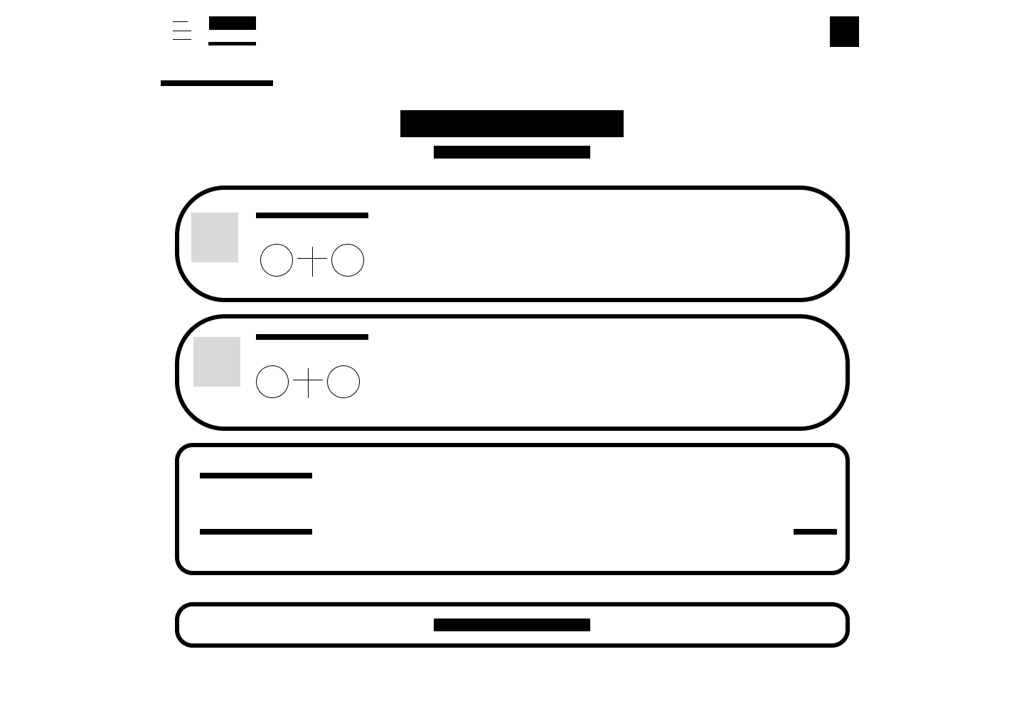
I created low fidelity wireframes to map out key screens including menu browsing, drink customization, cart review, and checkout. This allowed me to validate the ordering flow, ensure that users could complete tasks quickly, and confirm that the experience felt familiar to users accustomed to apps like Starbucks.
By prioritizing clarity and simplicity in the wireframes, I was able to test layout decisions early and identify areas where users might hesitate or drop off. This step ensured that the final design remained minimal, intuitive, and aligned with user expectations.
PROTOTYPE
After validating the structure through wireframes, I developed a clickable high fidelity prototype to simulate the full Grey Cafe online ordering experience. This stage focused on translating the minimalist visual direction into an interactive product that felt polished, modern, and familiar to users.
The prototype was fully deployed using Vercel, allowing users to interact with the experience in a real world context rather than a static design tool. To refine interactions and layout details, I edited and iterated on the code using Cursor, enabling faster adjustments and tighter alignment between design intent and functionality.
Deploying the prototype helped surface usability insights around pacing, clarity, and interaction patterns. It ensured the design translated seamlessly from concept to a functional, responsive experience that mirrors how users would actually order online.
Clickable Hi-Fi Prototype: https://grey-cafe.vercel.app
VALIDATION
We conducted validation testing of the clickable high fidelity prototype with 5 users from the target audience. Below is a summary of key findings from the Grey Cafe online ordering experience testing:
• 2 out of 5 users wanted clearer visual distinction between drink categories to help them scan the menu faster, especially when ordering on mobile.
• 1 out of 5 users was unsure whether customization options were required or optional when selecting a drink, causing hesitation before adding to cart.
• 1 out of 5 users hesitated at checkout and wanted clearer confirmation of pickup timing before completing the order.
• 2 out of 5 users expected a more explicit “Order Ahead” or “Ready for Pickup” indicator, similar to what they are used to in apps like Starbucks.
These insights highlighted opportunities to improve clarity, reduce friction during customization and checkout, and better align the experience with familiar ordering patterns used by similar cafe apps.
AFTER THOUGHTS
This project reinforced the importance of designing with familiarity in mind, especially when creating an online ordering experience. Aligning the flow with patterns users already understand, such as those used in the Starbucks app, helped reduce friction and build confidence throughout the process.
Validation testing showed that even small moments of ambiguity can interrupt an otherwise smooth experience. These insights emphasized the value of early testing and iteration, particularly around customization, pickup clarity, and visual hierarchy.
Overall, this project strengthened my ability to balance minimalism with usability. It highlighted that successful design is not just about how clean an interface looks, but how clearly it guides users from intent to action.
