THE PROBLEM
People who want to stay consistent with their goals struggle to maintain focus and track their daily progress
Students, creatives, and working professionals often try to build routines, stay productive, and manage long term goals, yet many struggle to remain consistent without a simple system that keeps them accountable.
These users are juggling school, work, personal projects, fitness goals, or creative careers. With so many priorities competing for attention, they need a better way to:
1. Organize their tasks and routines
2. Track progress in a clear and motivating way
3. Build long term habits without feeling overwhelmed
4. Stay accountable to their goals on a daily basis
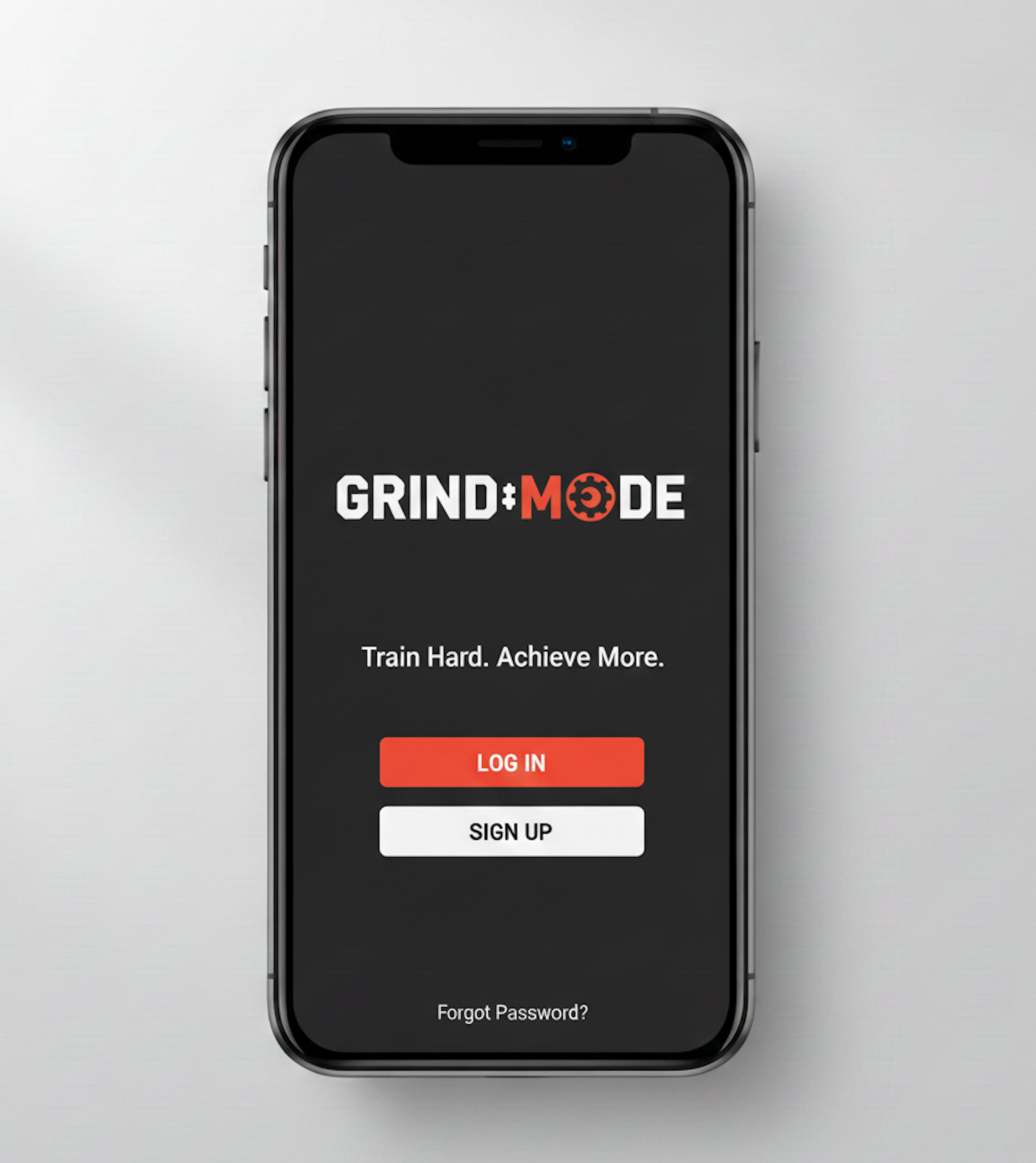
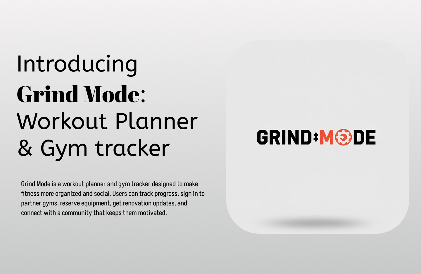
People want a tool that keeps them focused, encourages discipline, and helps them feel the satisfaction of steady progress. Grind Mode aims to solve this need.
THE PROCESS
As the UX designer on this project, I led the entire design process from discovery to final prototypes. I began with user research to understand real pain points and needs, then organized the insights to define the core tasks of the product. From there, I created initial UI sketches, tested concepts with users, and refined them into polished hi fi prototypes. Throughout the project, I communicated progress clearly, aligned the team on key milestones, and presented design decisions to stakeholders to secure buy in and keep the vision consistent.
While leading gyms have begun developing their own apps, the question is:
how can smaller and local gyms can design digital experiences that reflect their scale, resources, and customer relationships?
RESEARCH
User Research and Key Findings
We connected with customers with support from the sales team, and conducted interviews to better understand the problem and uncover customer pain points.
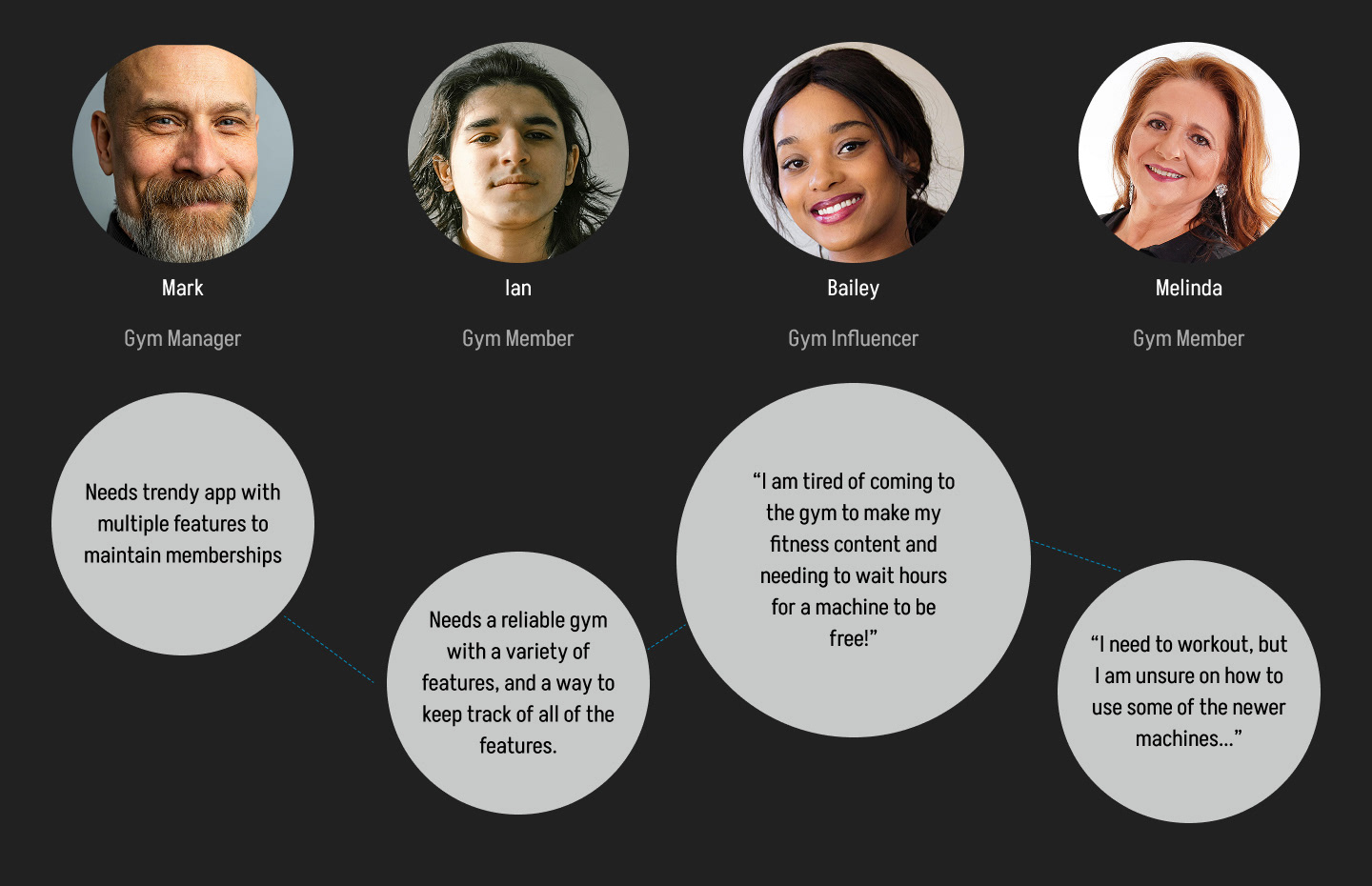
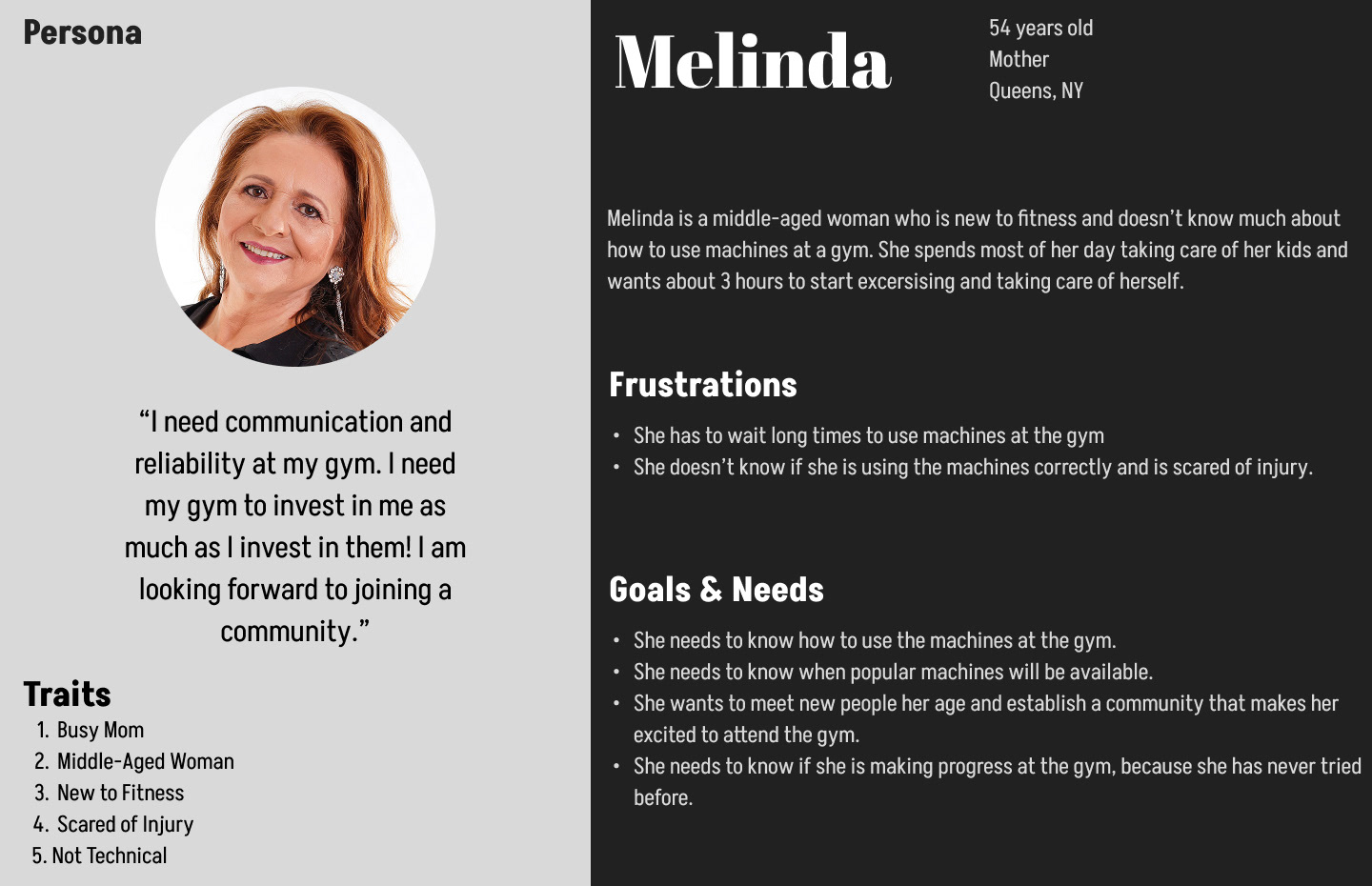
Persona
After analyzing the key findings, I created a provisional persona to help communicate information collected about users through out the design process.
IDEATION
Concept and Strategy
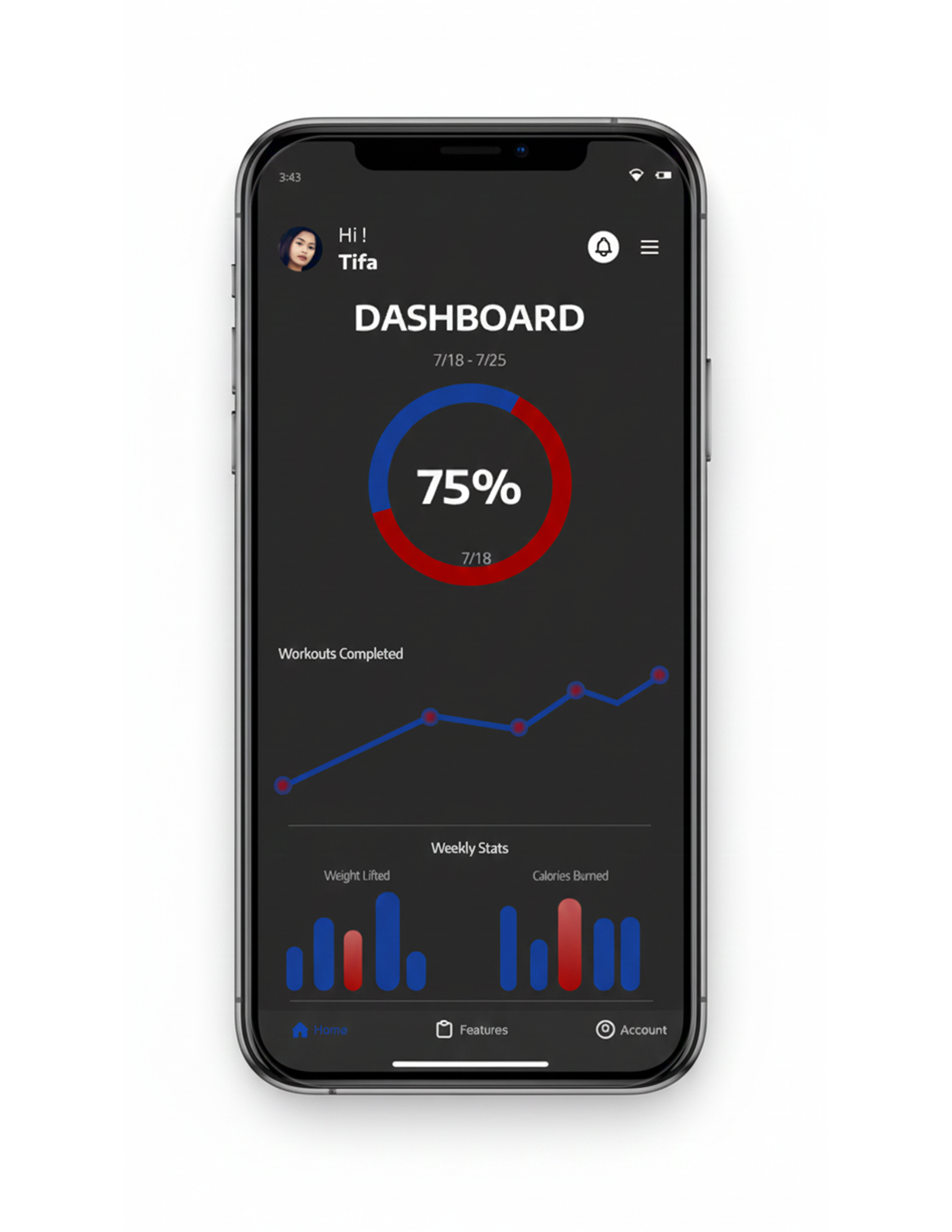
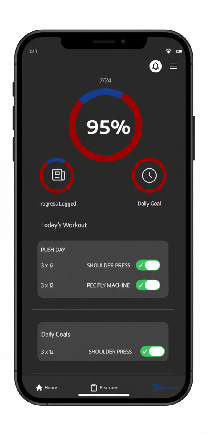
For Grind Mode, I designed a system that brings clarity, structure, and connection to the fitness experience. The concept focuses on giving users one place to plan workouts, track progress, sign in to partner gyms, reserve equipment, check renovation updates, and connect with their fitness community.
To support both users and gym staff, Grind Mode includes an admin side where gyms can update class schedules, equipment availability, and renovation changes at any time. This creates a real time, reliable experience that reduces confusion and helps users stay consistent with their goals.
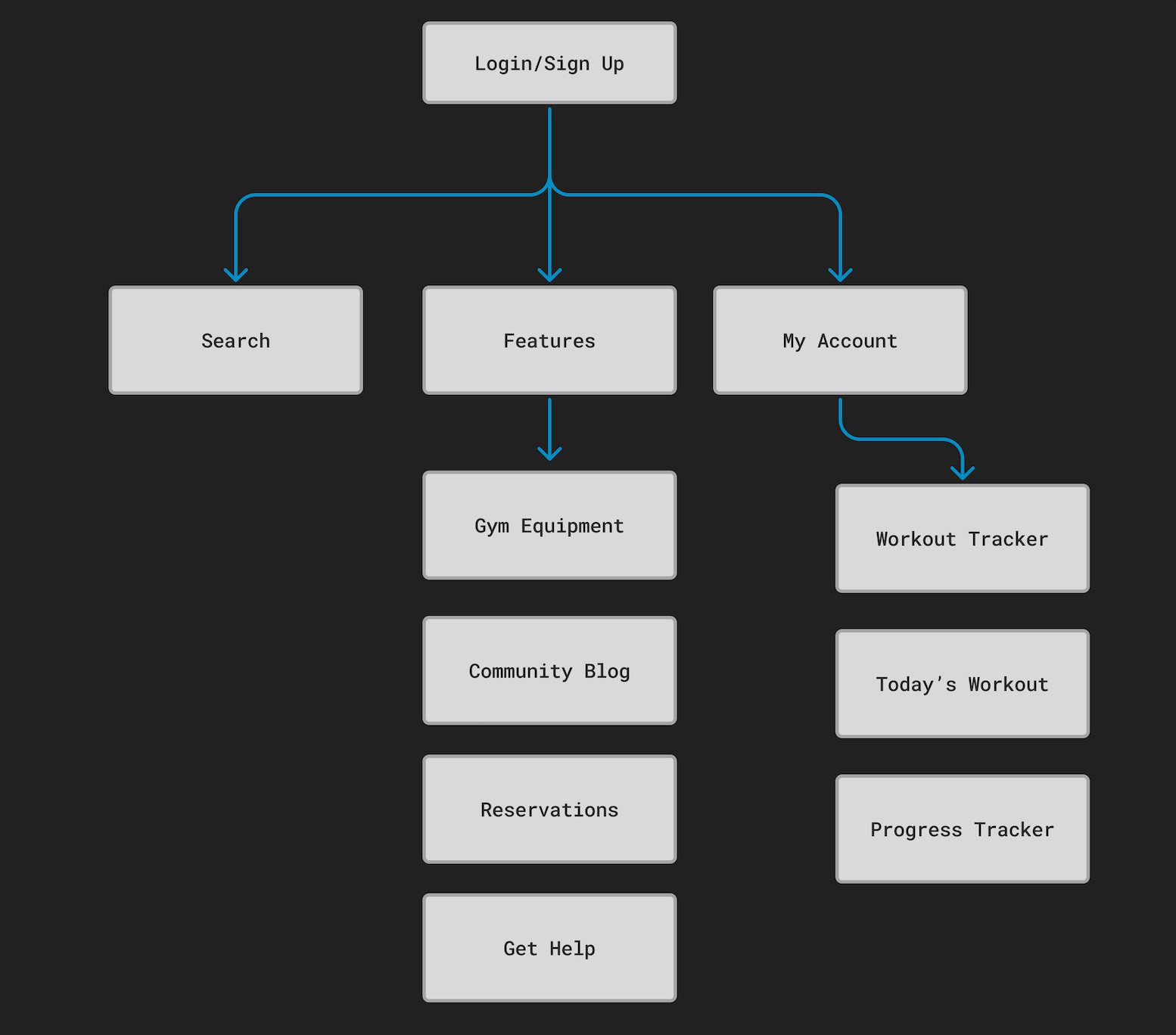
Information Architecture and Navigation
To organize the wide range of features in a way that stayed simple and intuitive, I created a hierarchical navigation system. This structure allows users to move smoothly between core areas like Workouts, Gym Access, Reservations, Updates, and Community without feeling overwhelmed. It also gives space for future growth as more gym partners or fitness features are added.
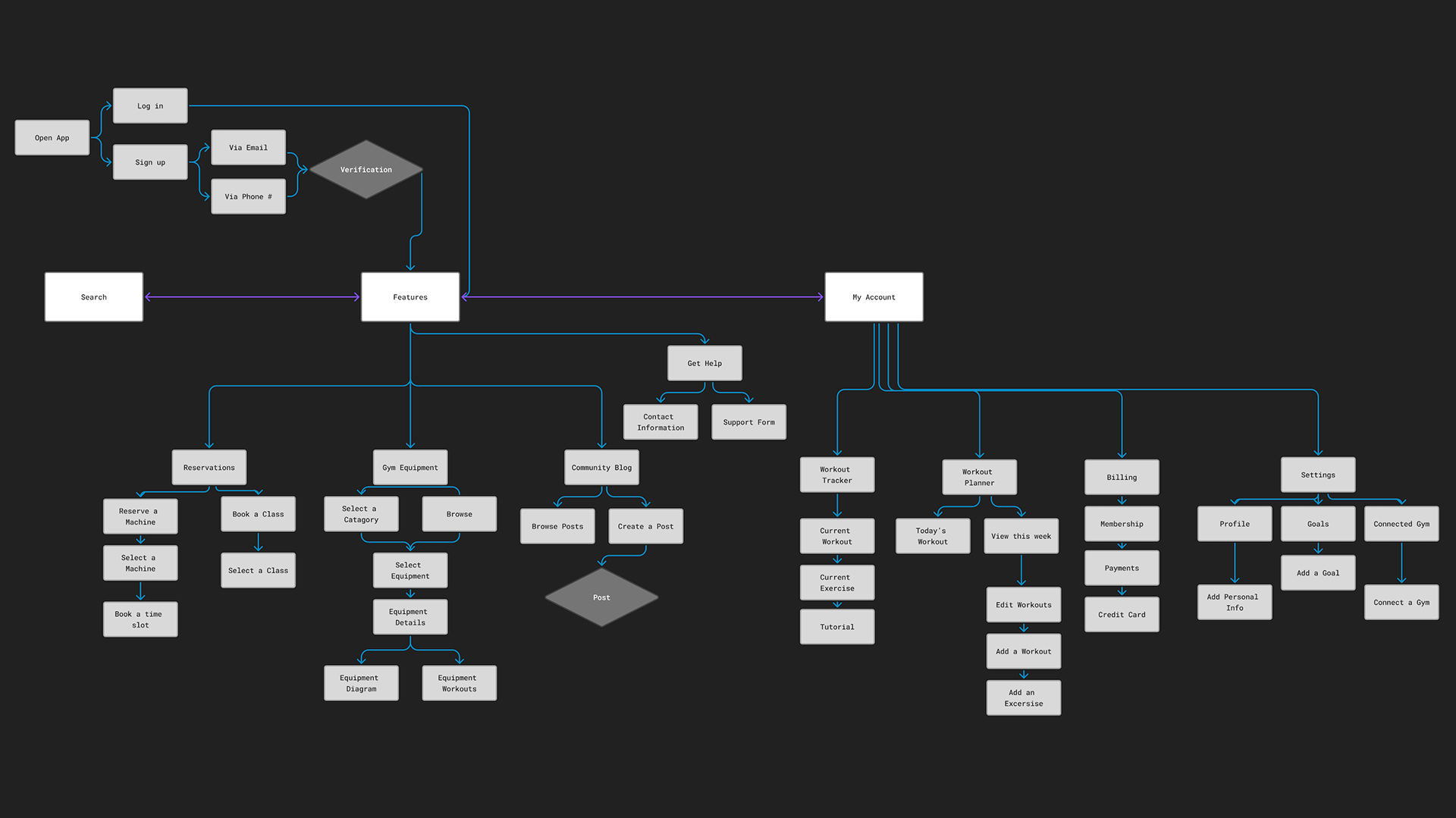
SITE MAP
Site Map and User Flows
I translated the concept into a full site map and detailed user flows that outlined how users would plan a workout, reserve equipment, check gym updates, or interact with the community. Working closely with the team, I refined the information architecture and aligned us on the product framework that guided the wireframes and final prototypes.
USER FLOWS
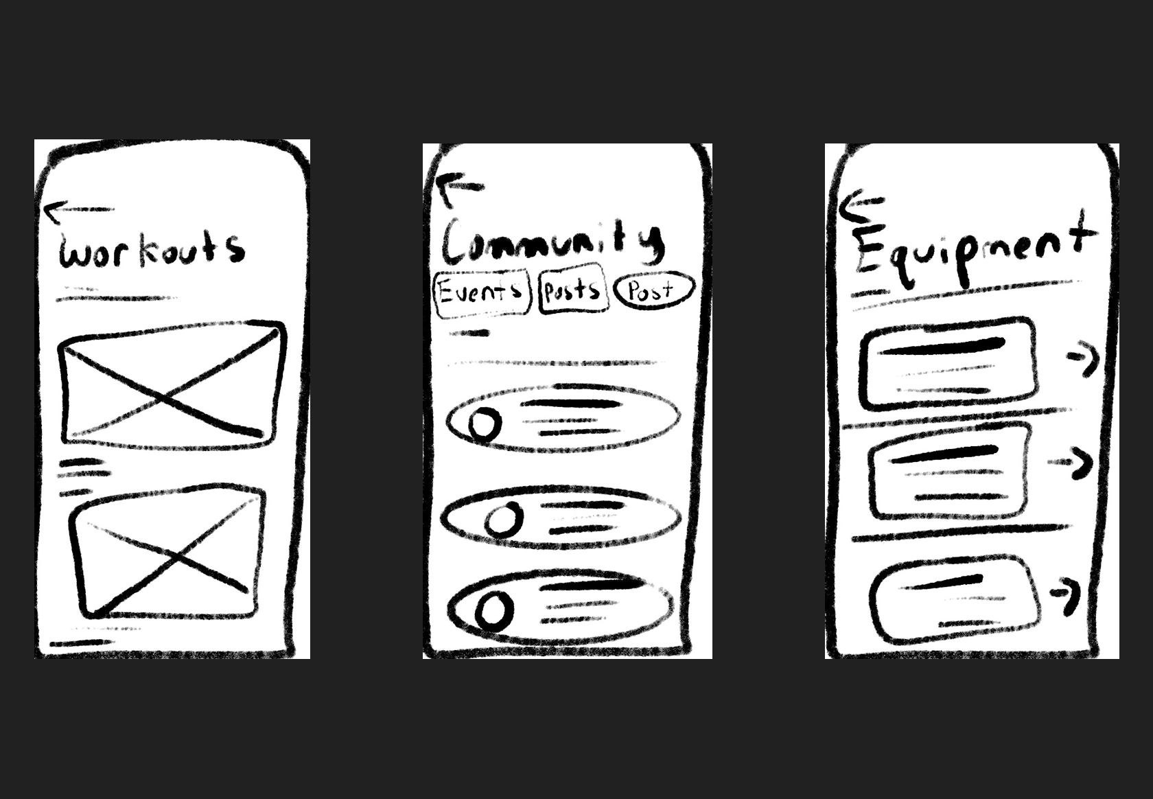
Lo-Fi Sketches
I sketched multiple options for each screen, continually referencing the target audience, company mission and objectives to share successful stories with customers.
Based on my research findings, I prioritized three key UX objectives for Grind Mode:
1. Ensure clarity and ease of access by creating a platform where users can quickly view gym schedules, equipment availability, partner gym access, and renovation updates without confusion or extra steps.
2. Strengthen user motivation and engagement by designing community features that make it easy for users to share progress, exchange tips, and stay connected with others working toward similar fitness goals.
3. Improve usability of workout planning and tracking by giving users simple, intuitive tools to build routines, track their data, and understand their progress through clear visual design.
PROTOTYPE
Hi Fi Prototype
In this phase, I refined the design based on feedback from the Lo Fi tests. Users were still unsure about how to reserve equipment, check gym updates, and access partner gym features. I improved the navigation, clarified key actions, and strengthened visual cues to make these tasks easier. These updates were applied while finalizing the UI and building the hi fi prototype.